Image 1 of 1: ‘screenshot of the JupyterLab for launching notebook’
Launching a new Python 3 Notebook
Image 1 of 1: ‘screenshot of the Jupyter notebook dropdown to change a cell to Markdown’

Changing a cell from Code to Markdown
Image 1 of 1: ‘Our first plot with Pandas, a scatter plot’
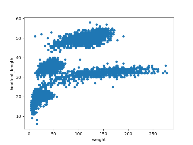
Image 1 of 1: ‘Adding transparency to our previous scatter plot’
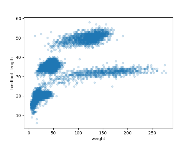
Image 1 of 1: ‘Changing the color of the points to our previous scatter plot’
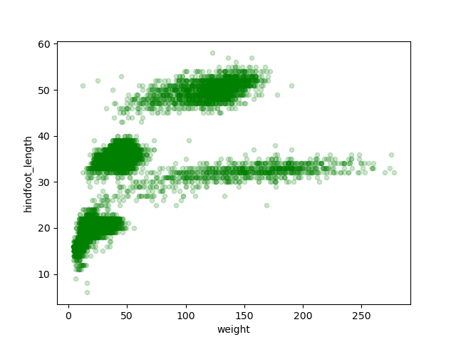
Image 1 of 1: ‘Box plot of the hindfoot_length variable’
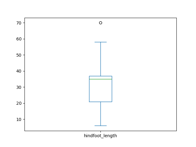
Image 1 of 1: ‘Box plot of the hindfoot_length variable by each plot’

Image 1 of 1: ‘Empty plot area in a Matplotlib plot’
Image 1 of 1: ‘Adding our previous box plot to the plot area’

Image 1 of 1: ‘Rotating x-axis labels to our previous box plot’

Image 1 of 1: ‘Customizing our previous box plot adding axis labels and a title’

Image 1 of 1: ‘A Matplotlib figure with two subplots, but empty still’

Image 1 of 1: ‘Adding scatter and box plots to our figure with two subplots’
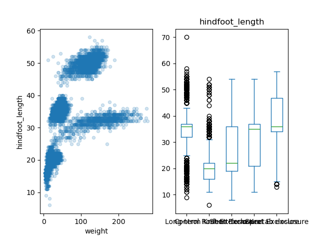
Image 1 of 1: ‘Customizing title and labels for our figure with two subplots’

Image 1 of 1: ‘A figure with three subplots: scatter, box, and histogram’
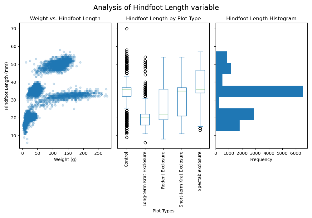
Image 1 of 1: ‘A figure with three subplots: scatter, box, and histogram’
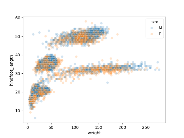
Image 1 of 1: ‘Weight by Species Site’
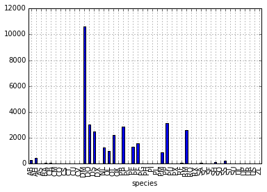
Image 1 of 1: ‘average weight across all species for each plot’
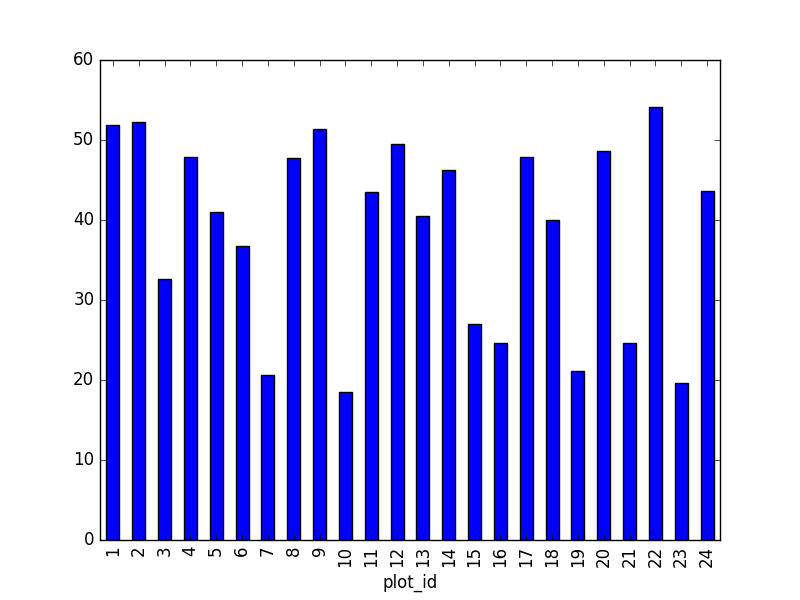
Image 1 of 1: ‘total males versus total females for the entire dataset’
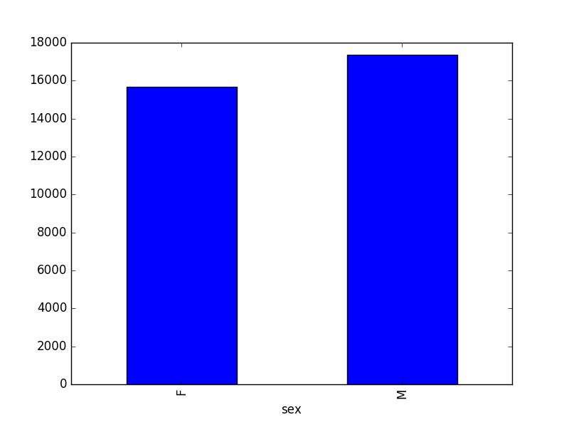
Image 1 of 2: ‘indexing diagram’
Image 2 of 2: ‘slicing diagram’
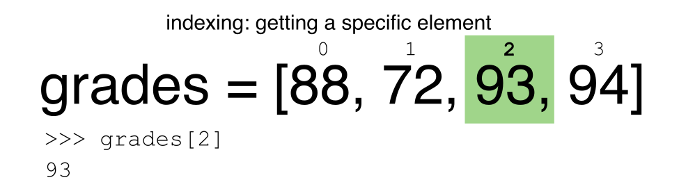
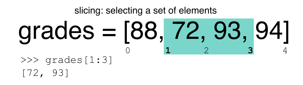
Image 1 of 1: ‘average weight for each year, grouped by sex’
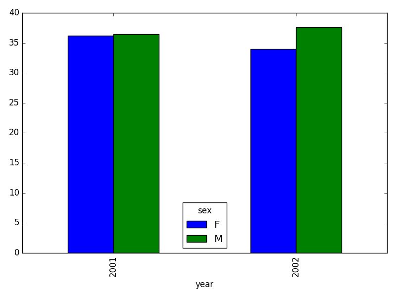
Image 1 of 1: ‘Inner join -- courtesy of codinghorror.com’
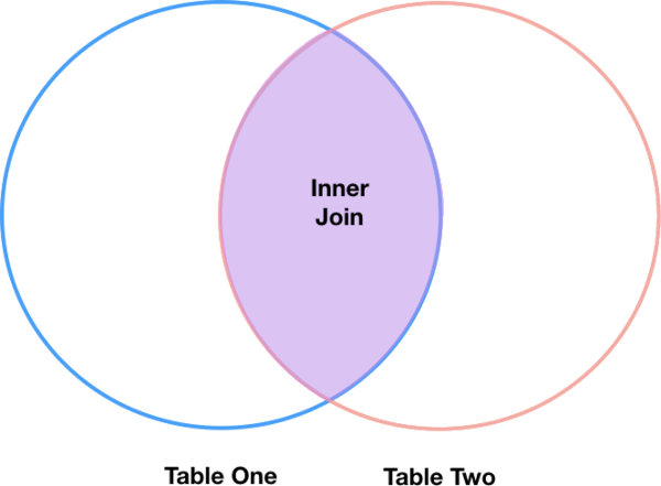
Image 1 of 1: ‘Left Join’

Image 1 of 1: ‘taxa per plot’

Image 1 of 1: ‘taxa per plot’
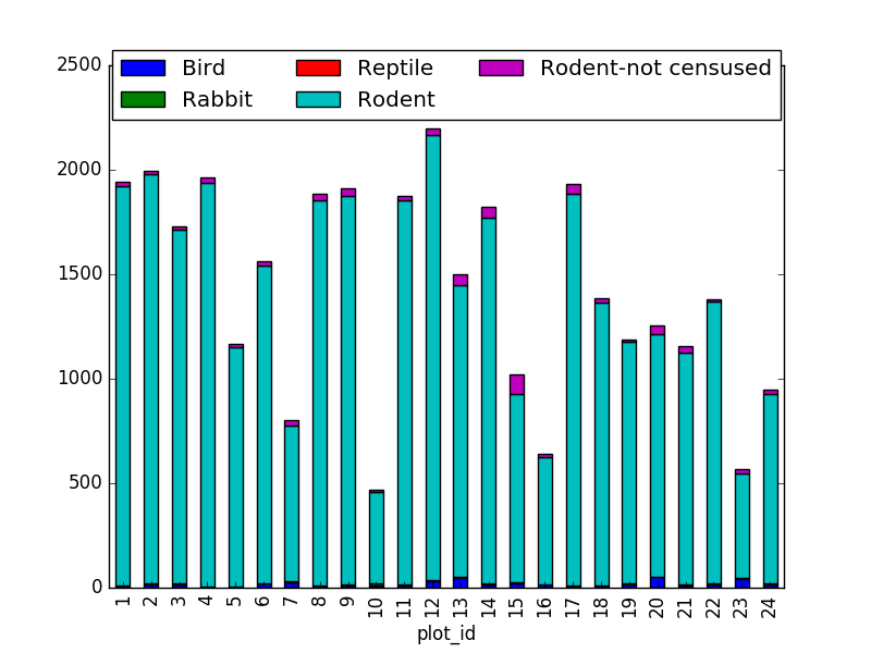
Image 1 of 1: ‘taxa per plot per sex’
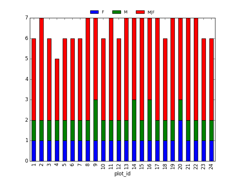
Image 1 of 1: ‘taxa per plot per sex’
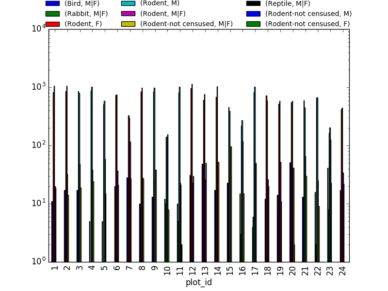
Image 1 of 1: ‘taxa per plot per sex’
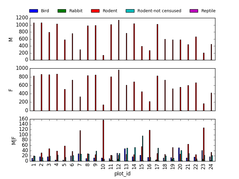
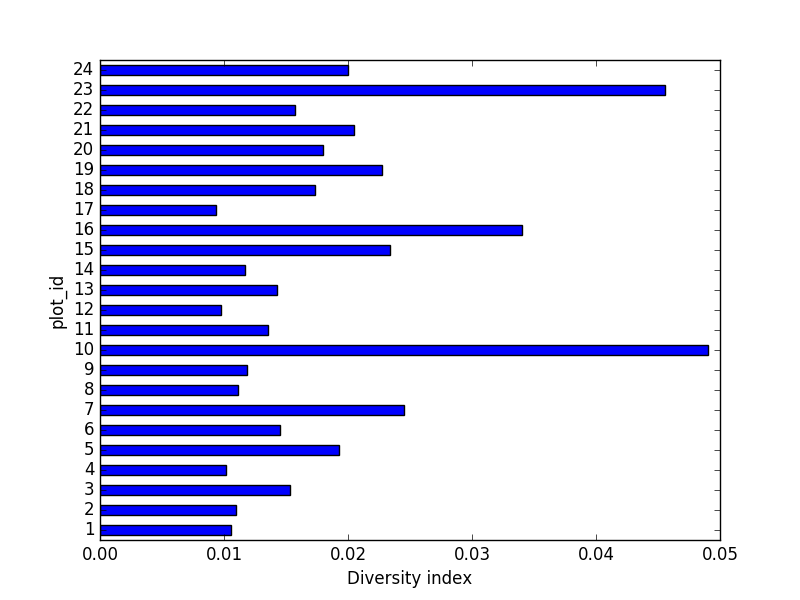
Image 1 of 1: ‘horizontal bar chart of diversity index by plot’