# map 12
# let's build monthly NDVI's for campus
# as in episode 12

# to answer the question:
# What month was the greenest?

# clean the environment and hidden objects
rm(list = ls())

# reset the par() before starting.
par(mfrow = c(1, 1))

# set map number
current_sheet <- 12
# set ggplot counter
current_ggplot <- 0

gg_labelmaker <- function(plot_num) {
  gg_title <- c("Map:", current_sheet, " ggplot:", plot_num)
  plot_text <- paste(gg_title, collapse = " ")
  print(plot_text)
  current_ggplot <<- plot_num
  return(plot_text)
}

# every ggtitle() or labs() should be:
# ggtitle(gg_labelmaker(current_ggplot+1))
# end automagic ggtitle           #######

library(scales)
library(tidyr)
library(dplyr)
library(ggplot2)
# library(raster)
library(terra)
library(geojsonsf) # to handle geojson
# library(sf) #<- to handle geojson (not geojsonsf? -KL)
library(lubridate)


# NDVIs were premade in the Carpentries lesson, but
# we already know enough raster math to make our
# own, as in
# episode 4

# brick is raster. rast is terra
# the 2 different ndvis looks VERY different when
# you do this raster math
# for now we leave raster::bricks behind

# make an NDVI for 1 file
tiff_path <- c("source_data/planet/planet/20232024_UCSB_campus_PlanetScope/PSScene/")

# for reference, plot ONE of our 8 band files with
# semi-natural color
# this is PlanetScope

image <- rast(paste(tiff_path, "20230912_175450_00_2439_3B_AnalyticMS_SR_8b_clip.tif", sep = ""))
# ala-episode 5
plotRGB(image, r = 6, g = 3, b = 1, stretch = "hist")
image

summary(image)

# here is the NDVI calculation:
# (NIR - Red) / (NIR + Red)
ndvi_tiff <- ((image[[8]] - image[[6]]) / (image[[8]] + image[[6]])) * 10000

# plot(ndvi_tiff)
summary(values(ndvi_tiff))
str(ndvi_tiff)
class(ndvi_tiff)
str(ndvi_tiff$nir)
plot(ndvi_tiff$nir)

# not sure how the columns get named "NIR"
# probably the first layer imported
# we will circle back to that

names(ndvi_tiff)
ndvi_tiff


# We need a common extent to
# stack things up
# we'll use the original AOI from our Planet request:
ucsb_extent <- vect("source_data/planet/planet/ucsb_60sqkm_planet_extent.geojson")
str(ucsb_extent)
crs(ucsb_extent)
crs(image) # <---- we want to standardize on this CRS
crs(ndvi_tiff)

# go ahead and assign it:
ucsb_extent <- project(x = ucsb_extent, y = image)
crs(ucsb_extent)

# the CRSs are now the same
crs(ucsb_extent) == crs(image)

# but the extents are different
ext(ucsb_extent) == ext(image)
ext(ucsb_extent) == ext(ndvi_tiff)


# I need to extend my calculated NDVI to the AOI extent
ndvi_tiff <- extend(ndvi_tiff, ucsb_extent)
# plot(ndvi_tiff)
ndvi_tiff


# extents are still different after extend:
ext(ucsb_extent) == ext(ndvi_tiff)

# so reset the extent back to the AOI
# extent object:
set.ext(ndvi_tiff, ext(ucsb_extent))


# now they are exactly the same extent
ext(ucsb_extent) == ext(ndvi_tiff)

plot(ndvi_tiff)
dim(ndvi_tiff)
str(ndvi_tiff)
names(ndvi_tiff)

# this works in ggplot too
ndvi_tiff_df <- as.data.frame(ndvi_tiff, xy = TRUE) %>%
  pivot_longer(-(x:y), names_to = "variable", values_to = "value")

str(ndvi_tiff_df)

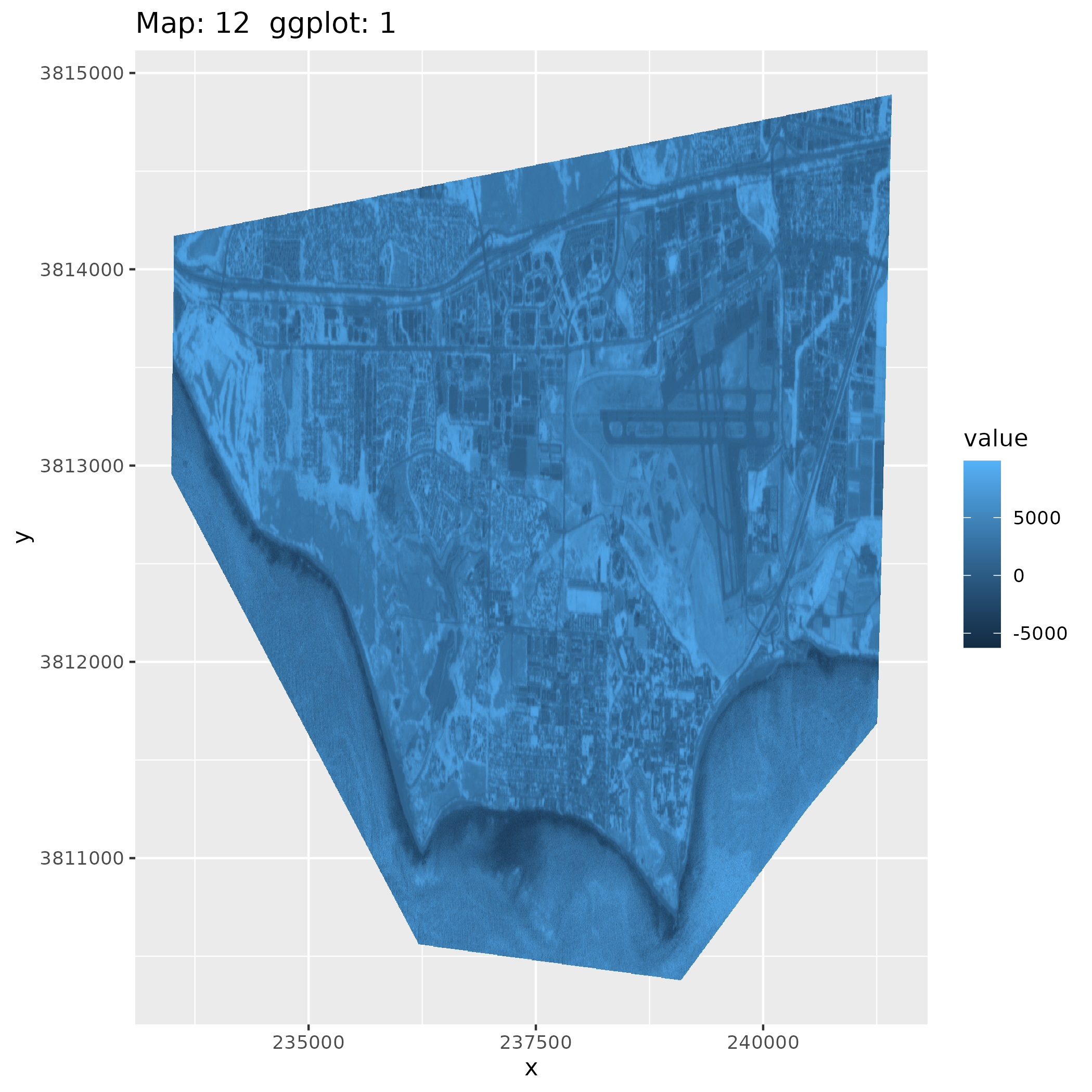
ggplot() +
  geom_raster(data = ndvi_tiff_df, aes(x = x, y = y, fill = value)) +
  ggtitle(gg_labelmaker(current_ggplot + 1))


# now let's load the 2023-24 8-band rasters
# loop over the files and build a raster stack

# get a file list
# ep 12
scene_paths <- list.files("source_data/planet/planet/20232024_UCSB_campus_PlanetScope/PSScene/",
  full.names = TRUE,
  pattern = "8b_clip.tif"
)
scene_paths

# someplace to put our images
dir.create("output_data/ndvi", showWarnings = FALSE)


# calculate the NDVIs
# and fill in (extend) to the AOI
# loop
# this takes a while
for (images in scene_paths) {
  source_image <- rast(images)
  source_image <- aggregate(source_image, fact = 4)
  ndvi_tiff <- ((source_image[[8]] - source_image[[6]]) / (source_image[[8]] + source_image[[6]]))
  new_filename <- (substr(images, 67, 90))
  new_path <- paste("output_data/ndvi/", new_filename, ".tif", sep = "")
  ndvi_tiff <- extend(ndvi_tiff, ucsb_extent, fill = NA, snap = "near")
  set.ext(ndvi_tiff, ext(ucsb_extent))
  names(ndvi_tiff) <- substr(new_filename, 0, 13)
  print(names(ndvi_tiff))
  print(new_filename)
  print(dim(ndvi_tiff))
  writeRaster(ndvi_tiff, new_path, overwrite = TRUE)
}


# 3 or 4 of the resulting tiffs are wonky
# their dimensions are wildly off.
# but almost all of them are 554 x 885 pixels
# let's get rid of the ones that aren't:

# # get a list of the new files:
ndvi_series_names <- list.files("output_data/ndvi")
ndvi_series_names

testraster_path <- paste("output_data/ndvi/", ndvi_series_names[1], sep = "")

testraster <- rast(testraster_path)


# check the files's resolutions and
# keep only the
# 554 x 885 now that we are downsampled
length(ndvi_series_names)
str(ndvi_series_names)
valid_tiff <- c(554, 885, 1)
str(valid_tiff)


# delete any files that aren't the standard
# resolution
for (image in ndvi_series_names) {
  test_size <- rast(paste("output_data/ndvi/", image, sep = ""))
  # length 1 qualifier
  test_result <- (dim(test_size) == valid_tiff)
  print(test_result)
  ifelse((dim(test_size) == valid_tiff), print("A match!!!"), file.remove(paste("output_data/ndvi/", image, sep = "")))
}

# reload the names
ndvi_series_names <- list.files("output_data/ndvi")
ndvi_series_paths <- paste("output_data/ndvi/", ndvi_series_names, sep = "")
ndvi_series_paths

# now we can see there are 4 fewer tiffs.
length(ndvi_series_names)

# now we can build a more standard raster stack with no errors
ndvi_series_stack <- rast(ndvi_series_paths)

summary(ndvi_series_stack[, 1])
str(ndvi_series_stack)
nlyr(ndvi_series_stack)
summary(values(ndvi_series_stack))

# they plot!:
# 20230427 still looks suspicious
plot(ndvi_series_stack)

ggsave("images/ndvi_series_stack_1.png", plot = last_plot(), bg = "white")

# there are duplicate column names / dates
# this turns out to be a feature!
# need to put it back in later

### let's crop the stack to the NCOS area to make a
#   more relevant map for campus.
#   and make this plotting even faster

# ncos_extent <- vect("source_data/planet/planet/ncos_aoi.geojson")
ncos_extent <- vect("scripts/ncos.geojson")

# I think this reprojection might cause just enough of a shift to muck us up
ncos_extent <- project(ncos_extent, ndvi_series_stack)

ndvi_series_stack <- crop(ndvi_series_stack, ncos_extent)
ndvi_series_stack
# 15 panels
plot(ndvi_series_stack)

ndvi_series_df <- as.data.frame(ndvi_series_stack, xy = TRUE, na.rm = FALSE) %>%
  pivot_longer(-(x:y), names_to = "image_date", values_to = "NDVI_value")
str(ndvi_series_df)

# the scales of NDVI values are correct!!!!
ggplot() +
  geom_raster(data = ndvi_series_df, aes(x = x, y = y, fill = NDVI_value)) +
  facet_wrap(~image_date) +
  ggtitle(gg_labelmaker(current_ggplot + 1))

# we need a diverging color scheme
# to make it look more like a proper ndvi (episode 13, except I choose an even better one)
ggplot() +
  geom_raster(data = ndvi_series_df, aes(x = x, y = y, fill = NDVI_value)) +
  scale_fill_distiller(palette = "RdYlGn", direction = 1) +
  facet_wrap(~image_date) +
  theme_minimal() +
  ggtitle(gg_labelmaker(current_ggplot + 1))


# fix those facet labels!
# this is what it should look like:
str(ndvi_series_df)
year_month_label <- sub(".*?([0-9]{8}).*", "\\1", ndvi_series_df$image_date)
year_month_label

# now that we've tested, mutate here to add the new column:
ndvi_series_w_dates_df <- mutate(ndvi_series_df, yyyymmdd = sub(".*?([0-9]{8}).*", "\\1", image_date))
ndvi_series_w_dates_df
str(ndvi_series_w_dates_df)

# now we only have 11 panels because there were some duplicate dates.
# but voila: now we don't have any empty areas:
ggplot() +
  geom_raster(data = ndvi_series_w_dates_df, aes(x = x, y = y, fill = NDVI_value)) +
  scale_fill_distiller(palette = "RdYlBu", direction = 1) +
  facet_wrap(~yyyymmdd) +
  theme_minimal() +
  ggtitle(gg_labelmaker(current_ggplot + 1))


# we need to arrange and clearly these by date.
# Julian dates. Converting to Julian dates is episode 13

# challenge: mutate on another column that is julian date.
str(ndvi_series_w_dates_df)

ndvi_series_dates_as_dates_df <- mutate(ndvi_series_w_dates_df, date = as_date(yyyymmdd))
str(ndvi_series_dates_as_dates_df)
ndvi_series_dates_as_dates_df$date

ndvi_series_julian_dates_df <- mutate(ndvi_series_dates_as_dates_df, julian_date = yday(date))

str(ndvi_series_julian_dates_df)

ggplot() +
  geom_raster(data = ndvi_series_julian_dates_df, aes(x = x, y = y, fill = NDVI_value)) +
  scale_fill_distiller(palette = "RdYlBu", direction = 1) +
  facet_wrap(~julian_date) +
  theme_minimal() +
  ggtitle(gg_labelmaker(current_ggplot + 1))

# does my 'feature' about combining layers actually
# add values together as they are stacking up?
# there's only 11 panels in my plot here.


# to find the 'greenest' months,  here, we can make
# histograms, make bins
# OR figure the mean NDVI for each image as in ep 14.

# this default one shows us what?
# looks like April 2024 is the greenest:

str(ndvi_series_dates_as_dates_df)
ggplot(ndvi_series_dates_as_dates_df) +
  geom_histogram(aes(NDVI_value)) +
  facet_wrap(~date) +
  ggtitle(gg_labelmaker(current_ggplot + 1))


# maybe we want some custom bins at common NDVI break points
summary(ndvi_series_dates_as_dates_df)

local_ndvi_breaks <- c(-1, 0, .001, .01, .1, .11, .115, .2, .4, 1)

ndvi_series_custom_binned_df <- ndvi_series_dates_as_dates_df %>%
  mutate(bins = cut(NDVI_value, breaks = local_ndvi_breaks))

str(ndvi_series_custom_binned_df)
# this is still a visual judgement call, but April and June look pretty green
# and we can't read the x axis
ggplot(ndvi_series_custom_binned_df, aes(x = bins)) +
  geom_bar() +
  facet_wrap(~date) +
  ggtitle(gg_labelmaker(current_ggplot + 1))


# how about on a map?
str(ndvi_series_custom_binned_df)
ggplot() +
  geom_raster(data = ndvi_series_custom_binned_df, aes(x = x, y = y, fill = NDVI_value)) +
  scale_fill_distiller(palette = "RdYlBu", direction = 1) +
  facet_wrap(~date) +
  theme_minimal() +
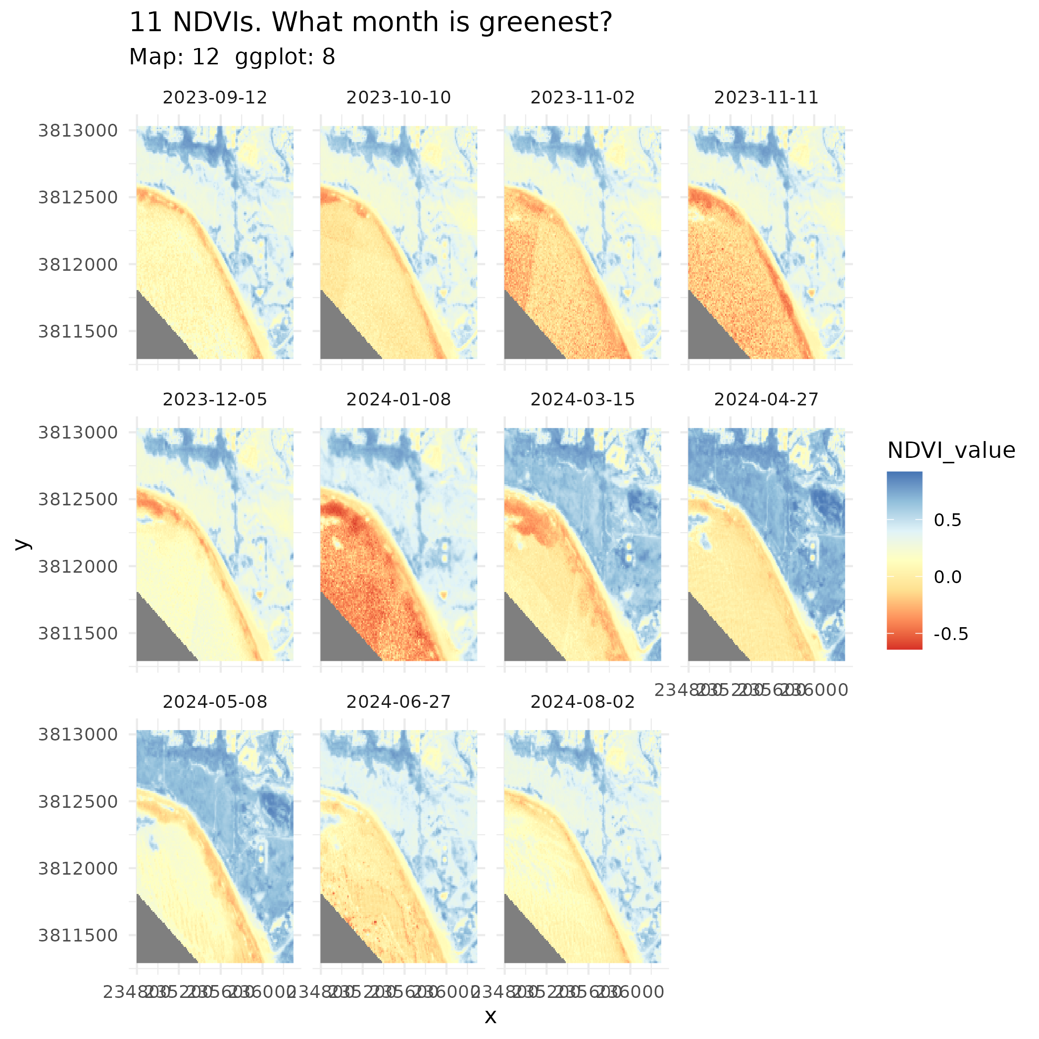
  ggtitle("11 NDVIs. What month is greenest?", subtitle = gg_labelmaker(current_ggplot + 1))

ggsave("final_output/map_12.png", plot = last_plot(), bg = "white")

# this is the OR from above.
# visually we can't see the greenest, so
# let's make a dataframe of average NDVI
# and plot them
# this is from ep. 14:

str(ndvi_series_custom_binned_df)

# this ep 14 tidbit isn't working.
# maybe we need to work on spatrasters.
avg_NDVI <- global(ndvi_series_stack, mean, na.rm = TRUE)


avg_NDVI
str(avg_NDVI)
ncol(avg_NDVI)

ndvi_months <- c(row.names(avg_NDVI))
avg_NDVI <- mutate(avg_NDVI, months = ndvi_months)
str(avg_NDVI)

colnames(avg_NDVI) <- c("MeanNDVI", "Month")

avg_NDVI


avg_NDVI
summary(avg_NDVI)
str(avg_NDVI)

# here we go #############

# finally: a logical plot of average NDVIs over time.
# plot(avg_NDVI$MeanNDVI)

avg_NDVI_df <- as.data.frame(avg_NDVI, rm.na = FALSE)
str(avg_NDVI_df)

ggplot(avg_NDVI_df, mapping = aes(Month, MeanNDVI)) +
  geom_point() +
  ggtitle(gg_labelmaker(current_ggplot + 1), subtitle = "can't read this axis")

# turn the x axis vertical.
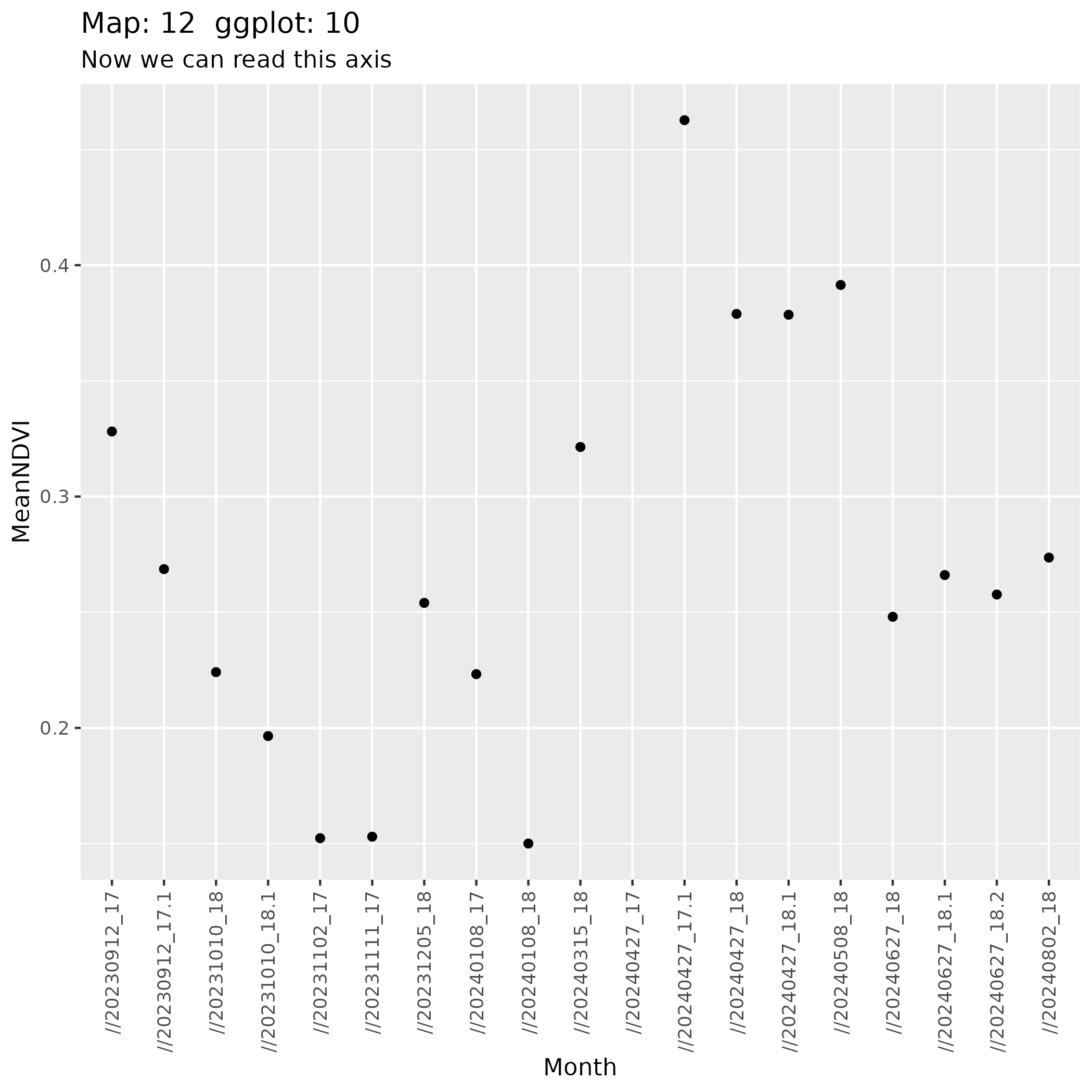
ggplot(avg_NDVI_df, mapping = aes(Month, MeanNDVI)) +
  geom_point() +
  theme(axis.text.x = element_text(angle = 90, vjust = 0.5, hjust = 1)) +
  ggtitle(gg_labelmaker(current_ggplot + 1), subtitle = "Now we can read this axis")

ggsave("final_output/plot_12.png", plot = last_plot(), bg = "white")


# ==============================================================================
# Final Output Plate: Well-Formatted Month-by-Month NDVI Small Multiples
# ==============================================================================

# Aggregate pixel-level NDVI by calendar month across the annual cycle
monthly_ndvi_df <- ndvi_series_df %>%
  filter(!is.na(NDVI_value)) %>%
  mutate(
    date_str = sub(".*?([0-9]{8}).*", "\\1", image_date),
    date = as_date(date_str),
    year_month = format(date, "%Y-%m"),
    month_name = format(date, "%B %Y")
  ) %>%
  group_by(x, y, year_month, month_name) %>%
  summarize(NDVI = mean(NDVI_value, na.rm = TRUE), .groups = "drop") %>%
  arrange(year_month)

# Enforce chronological ordering of month panels
monthly_ndvi_df$month_name <- factor(
  monthly_ndvi_df$month_name,
  levels = unique(monthly_ndvi_df$month_name)
)

# Render publication-quality small multiples plate
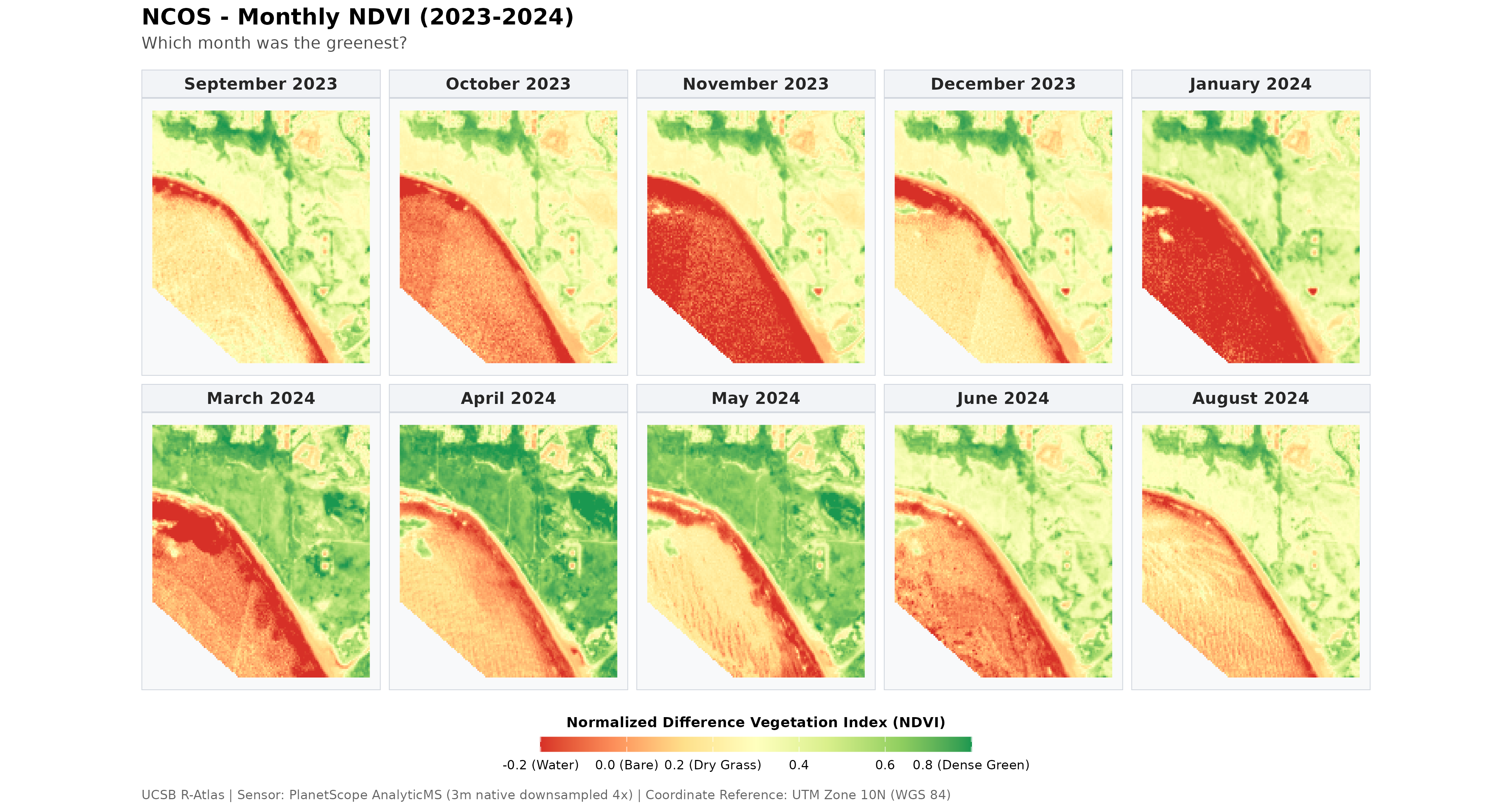
map_12_small_multiples <- ggplot(monthly_ndvi_df) +
  geom_raster(aes(x = x, y = y, fill = NDVI)) +
  scale_fill_distiller(
    palette = "RdYlGn",
    direction = 1,
    limits = c(-0.2, 0.8),
    oob = scales::squish,
    breaks = seq(-0.2, 0.8, by = 0.2),
    labels = c("-0.2 (Water)", "0.0 (Bare)", "0.2 (Dry Grass)", "0.4", "0.6", "0.8 (Dense Green)"),
    guide = guide_colorbar(
      title = "Normalized Difference Vegetation Index (NDVI)",
      title.position = "top",
      title.hjust = 0.5,
      barwidth = unit(20, "lines"),
      barheight = unit(0.7, "lines")
    )
  ) +
  facet_wrap(~month_name, ncol = 5) +
  coord_equal() +
  labs(
    title = "North Campus Open Space (NCOS) - Monthly NDVI Phenology (2023-2024)",
    subtitle = "Month-by-month vegetation dynamics from PlanetScope 8-band multispectral satellite imagery (3m resolution)",
    caption = "UCSB R-Atlas | Sensor: PlanetScope AnalyticMS (3m native downsampled 4x) | Coordinate Reference: UTM Zone 10N (WGS 84)"
  ) +
  theme_minimal(base_size = 11) +
  theme(
    plot.title = element_text(face = "bold", size = 15, hjust = 0.5, margin = margin(b = 5)),
    plot.subtitle = element_text(size = 11, color = "grey30", hjust = 0.5, margin = margin(b = 12)),
    plot.caption = element_text(size = 8.5, color = "grey40", hjust = 0.5, margin = margin(t = 10)),
    strip.text = element_text(face = "bold", size = 11, color = "grey15"),
    strip.background = element_rect(fill = "#f2f4f7", color = "#d0d5dd", linewidth = 0.5),
    panel.border = element_rect(color = "#d0d5dd", fill = NA, linewidth = 0.5),
    panel.grid = element_blank(),
    axis.title = element_blank(),
    axis.text = element_blank(),
    axis.ticks = element_blank(),
    legend.position = "bottom",
    legend.title = element_text(size = 9.5, face = "bold"),
    legend.text = element_text(size = 8.5),
    legend.margin = margin(t = 6, b = 2),
    plot.background = element_rect(fill = "white", color = NA),
    panel.background = element_rect(fill = "#f8f9fa", color = NA)
  )

print(map_12_small_multiples)
ggsave("final_output/map_12_monthly_ndvi.png", plot = map_12_small_multiples, width = 14, height = 7.5, dpi = 300, bg = "white")
ggsave("images/map12_monthly_ndvi.png", plot = map_12_small_multiples, width = 14, height = 7.5, dpi = 300, bg = "white")
file.copy("final_output/map_12_monthly_ndvi.png", "final_output/map_12_small_multiples.png", overwrite = TRUE)


# we still need to format those as Julian dates
# hallucinated graph:
# ggplot(avg_NDVI_df, mapping = aes(JulianDate, MeanNDVI)) +
#  geom_point() +
#  ggtitle(gg_labelmaker(current_ggplot+1), subtitle = "Now we can read this axis")


# we'll need weather data to mimic the lesson.
# or use our brains and eyes to define
# when was it rainiest?


current_sheet <- "Map 12 Complete"
current_sheet